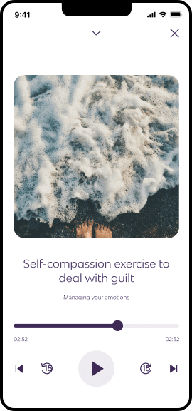
Re-brand, re-contextualise and re-build

The Prolem

Peppy was going global and re-branding. I was tasked with helping the team manage the product rebrand, think about the product's future direction and increase user engagement.

The role

Firstly, I was tasked with taking the new brand and building out a design system where none previously existed. Secondly, work with the Product Director to assess the current state of the product and produce a vision for the company to build towards. Finally, work with the larger Peppy team to develop and improve existing features to ensure the best product for Peppy users.

The Challenges

The most challenging aspect of Peppy was working backwards to find out how everything had been designed and built. The existing files were sparse with no documentation and no process had been followed. This coupled with a lot of inconsistency between the product and design, approaching a rebrand required a lot of work.

Re-branding peppy

Step 1

Taking on a whole new look

Working closely with the developers I built out a new design system that allowed us to quickly phase out the old brand and bring in the new.

Step 1

Taking on a whole new look

Working closely with the developers I built out a new design system that allowed us to quickly phase out the old brand and bring in the new.

Step 1

Taking on a whole new look

Working closely with the developers I built out a new design system that allowed us to quickly phase out the old brand and bring in the new.

Step 1

Taking on a whole new look

Working closely with the developers I built out a new design system that allowed us to quickly phase out the old brand and bring in the new.

Building out a design system

Create a vision

Create a vision

Step 2

Thinking about the future

A key aspect of my role at Peppy was to work with the product leaders to develop and prototype a short term vision for the Peppy product.

This involved exploring ways to reduce onboarding, personalising content for user to both engage them and make the app “stickier”, as well as some new features for later in the product development.

Improve features

Problem 2

Educate, engage and personalise

I was tasked with improving engagement with the Discover screen content. By talking to Peppy users we found that many were still unsure exactly what Peppy was and how it could help them and they weren’t sure where to start or what to look at.

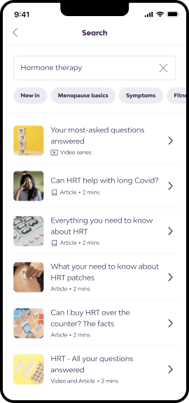
This was backed up by the fact that 93% of users found all of their content by browsing, only 7% found content via search.

To ensure the Discover screen was both relevant and useful to the user we decided to experiment with task cards.

Feature documentation:

Problem 2

Educate, engage and personalise

I was tasked with improving engagement with the Discover screen content. By talking to Peppy users we found that many were still unsure exactly what Peppy was and how it could help them and they weren’t sure where to start or what to look at.

This was backed up by the fact that 93% of users found all of their content by browsing, only 7% found content via search.

To ensure the Discover screen was both relevant and useful to the user we decided to experiment with task cards.

Problem 1

Increase video content views

Content types within Peppy were hard to distinguish between and there was an internal desire to increase views of video content.

To answer these challenges I created a clean labelling system along with short previews of videos to engage users.

Result:

I'm happy to say that this solution contributed to a 25% lift in video consumption from the home screen.

Video

What are the best non-HRT options?

4 mins

Video

What lifestyle factors can help my symptoms?

4 mins

Solution documentation:

Gif example

Video

What are the best non-HRT options?

2 mins

GIF (added by content)

Activate gif horizontally

Video

What are the best non-HRT options?

2 mins

40%

60%

Video

What are the best non-HRT options?

2 mins

40%

60%

Activate gif vertically

Video

What are the best non-HRT options?

2 mins

40%

60%

Video

What are the best non-HRT options?

2 mins

40%

60%

Improve features

Problem 1

Increase video content views

Content types within Peppy were hard to distinguish between and there was an internal desire to increase views of video content.

To answer these challenges I created a clean labelling system along with short previews of videos to engage users.

Result:

I'm happy to say that this solution contributed to a 25% lift in video consumption from the home screen.

Video

What are the best non-HRT options?

4 mins

Video

What lifestyle factors can help my symptoms?

4 mins

Video

What are the best non-HRT options?

4 mins

Video

What lifestyle factors can help my symptoms?

4 mins

Video

What are the best non-HRT options?

4 mins

Video

What lifestyle factors can help my symptoms?

4 mins

Solution documentation:

Activate gif horizontally

Gif example

Video

Video

Video

What are the best non-HRT options?

2 mins

GIF (added by content)

Video

Video

Video

What are the best non-HRT options?

2 mins

40%

60%

Video

Video

Video

What are the best non-HRT options?

2 mins

40%

60%

Key learnings and takeaways

Involve the team.
The best way to get buy-in is to have the team create and use the tools alongside you. Involve the right people for the best results.

Be kind to your developers
Often designers can assume that everything about their design is crystal clear. Rather than assume, make sure it is and communicate with your developers to ensure the best results for both you and them.

Create consistency
I worked with a developer once who had a great saying “better to be consistently wrong, than wrong inconsistently”. When it comes to designs, strive for consistency as it will help you in the future.

Create consistency
I worked with a developer once who had a great saying “better to be consistently wrong, than wrong inconsistently”. When it comes to designs, strive for consistency as it will help you in the future.

Problem 2

Educate, engage and personalise

I was tasked with improving engagement with the Discover screen content. By talking to Peppy users we found that many were still unsure exactly what Peppy was and how it could help them and they weren’t sure where to start or what to look at.

This was backed up by the fact that 93% of users found all of their content by browsing, only 7% found content via search.

To ensure the Discover screen was both relevant and useful to the user we decided to experiment with task cards.

Feature documentation: